
IELTS Writing Task 1 Template: Easy Layout with Sentence Starters
If you’re preparing for IELTS Academic Writing Task 1, this guide gives you everything you need to get started. You’ll learn a simple paragraph-by-paragraph structure, useful sentence starters, and see a full sample answer with a matching bar chart.
Use this writing template to practise writing clear, well-organised responses for any type of visual — from charts and graphs to diagrams and maps. This structure is explained in more detail in my IELTS writing templates guide.
What is IELTS Writing Task 1?
In Task 1 of the IELTS Academic test, you will:
- Look at a chart, graph, table, map, or process
- Write a short summary (at least 150 words)
- Explain the main trends or key features
- Do not give your opinion
Your score depends on how clearly and logically you present the information.
Your Easy IELTS Task 1 Writing Template
Use this layout to write your answer. Try to keep it simple and clear.
Paragraph 1 – Introduction
Start by saying what the visual shows. Use your own words (don’t copy the question).
Sentence starters:
- “The bar chart shows…”
- “The diagram illustrates…”
- “The graph compares…”
Example:
The bar chat shows the number of students who studied in 5 different countries in 2020.
Paragraph 2 – Overview
Give a general summary. What’s the biggest trend or most obvious thing?
Don’t use numbers in this part.
Sentence starters:
- “Overall, we can see that…”
- “In general, it is clear that…”
- “The main trend is…”
Example:
Overall, most students went to Country A, while Country C had the lowest number.
Paragraphs 3 and 4 – Details with Data
Now write 1–2 short paragraphs describing the details. Use the numbers or stages from the visual. Compare things when you can.
Sentence starters:
- “In 2020, the number of…”
- “Compared to…, the figure for…”
- “While X increased, Y decreased.”
Example:
In 2020, 50,000 students chose Country A. Country B had about 40,000, while Country C had just 10,000 students.
Final Paragraph – (Optional) Short Conclusion
Not required, but you can add a sentence to sum up what you’ve said.
Sentence starter:
- “In conclusion, the chart shows…”
Example:
In conclusion, Country A was the most popular destination for students in 2020.
Helpful Tips
- Use your own words to describe the chart.
- Don’t write about everything — focus on the main trends.
- Use linking words like however, in contrast, also, while.
- Stick to the word limit: 150–190 words is enough.
- Use past tense if the chart is about the past.
Sample IELTS Writing Task 1 Answer
Question Prompt:
The chart below shows the percentage of households in four countries with internet access between 2000 and 2020.
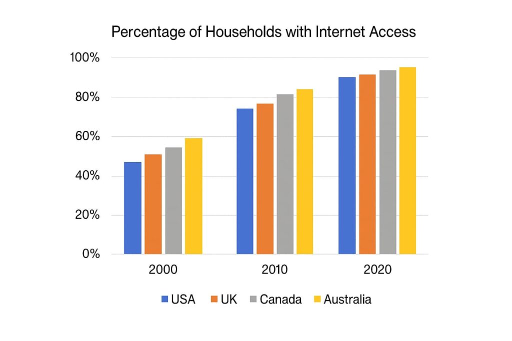
Introduction
The bar chart illustrates the percentage of households with internet access in four countries—USA, UK, Canada, and Australia—between 2000 and 2020.
Overview
Overall, all four countries saw an increase in internet access over the 20-year period, with the USA consistently having the highest percentage. Australia showed the fastest growth.
Details – Paragraph 1
In 2000, about 45% of households in the USA had internet access, compared to approximately 55% in Canada and 50% in the UK. Australia had the highest rate at approximately 60%. By 2010, the numbers rose significantly, with the USA reaching 75%, and Australia climbing to over 80%.
Details – Paragraph 2
By 2020, internet access was widespread in all four countries. Australia led with 95%, followed by Canada and the UK at 90%. The USA also reached 85%, despite starting from the lowest point.
(Optional) Conclusion
In conclusion, all countries experienced steady growth, and by 2020, internet access had become nearly universal.
Key Tips for Success
- Coherence and Cohesion: Use linking words to connect your ideas smoothly. Phrases like “in contrast,” “moreover,” and “as for” help maintain flow.
- Lexical Resource: Use a range of vocabulary to describe trends and data. Words like “increase,” “decline,” “fluctuate,” and “remain steady” are useful.
- Grammatical Range and Accuracy: Use a variety of sentence structures. Mix simple and complex sentences to show linguistic competence.
- Accuracy in Data Representation: Always ensure the information you provide is accurate according to the data given. Misinterpreting data can lower your score.
Next Steps in Your IELTS Writing
This template gives you a simple structure you can follow in the exam. Start by trying it with a few sample charts or diagrams.
- What to do next:
- Try this template with a few real IELTS questions
- Learn key vocabulary for describing visuals in our guide: IELTS Writing Vocabulary for Describing Charts and Graphs